How Much Does Google Ads Cost? (Hidden Costs for Advertisers)
Average Google Ads CPC is $5.26, but our research shows advertisers are actually paying $5.62 due to invalid activity. Here's where the difference goes.


We improve your ad performance by blocking click fraud and fake emails

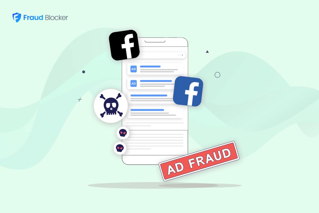
Click fraud is costing advertisers billions in loses. Learn more here.

Click fraud is costing advertisers billions in loses. Learn more here.


Read our in-depth study by independent research firm Juniper Research.


Our attention spans are shrinking, according to the American Psychological Association. As the researchers note, the average attention span was around two and a half minutes in 2004 and 75 seconds in 2012. Today, it’s a mere 47 seconds.
However, don’t assume people will spend 47 seconds looking at your ads. Digital attention spans are much shorter due to ad fatigue information overload, and other factors.
For example, many consumers view ads on their mobile devices while at work or on the go. They scroll quickly, often skimming rather than fully engaging, which means your ad is competing against notifications, videos, and social media posts for their attention.
Then there’s banner blindness, a phenomenon that occurs when people subconsciously ignore ads. Add to that the growing use of ad blockers and the ease in which AI website builders can create instant, beautiful sites in seconds, and it’s clear why designing impactful banners requires more than just creative flair.
Not sure what to do next? Here are seven best practices to create effective banner ads for short attention spans.
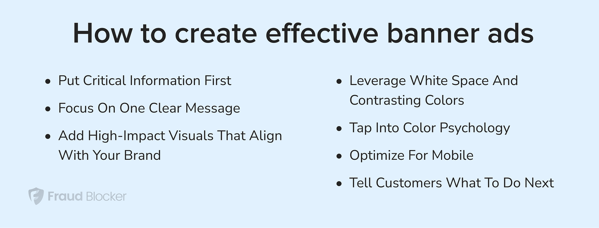
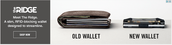
The best banner ads have a single, clear message. For example, this ad revolves around The Ridge Wallet, introducing viewers to its key features. It says, “Meet The Ridge. A slim, RFID-blocking wallet designed to streamline.”
Trying to say too much at once can overwhelm and confuse customers. The Ridge could have gone into details about the wallet’s design, technology, or price, but these extra details were unnecessary.
Make sure your ads communicate value instantly. Keep the copy simple and concise to prevent information overload.
Photos and other visuals convey complex messages in a simple manner, making it easier to get your point across. Plus, they’re more likely to draw attention than text.
However, you can’t just throw in a cool photo or illustration along with a “Buy now” button and expect viewers to click on it. Your visuals should reflect your brand’s personality and resonate with the target audience.
Let’s assume you sell fitness apparel and want to promote a new collection of leggings for women.
One option is to create a banner featuring a static image of the leggings along with ad copy. That’s not bad, but you could get more views and clicks by showing a strong, confident woman using your products.
For instance, consider adding a shot of a female athlete running or squatting while wearing the leggings. Incorporate motion blur effects or subtle background movement to create energy and help shoppers imagine themselves wearing the product in your advert.
White space, or negative space, improves readability and comprehension while reducing visual clutter. At the same time, it guides the viewer’s gaze, focusing their attention on your message, explains the International Journal of Novel Research and Development.
Similarly, contrasting colors like yellow text on a dark background make your text pop, enhancing readability. Use them to draw attention to the ad headline, core message, product photo, or other specific elements.
Both white space and contrasting colors can add that “wow” factor, enticing viewers to click on your ad. Moreover, they improve accessibility and can help you reach a wider audience, including consumers with visual impairments.
Use colors that align with the message you want to send across. For instance, red denotes love, passion, excitement, or urgency, depending on the context. That’s why it’s commonly used for call-to-action buttons or key pieces of information.
Each color carries a distinct message and evokes different emotions. Let’s see a few examples:
A fitness brand running a flash sale could use a bold red background with white text saying, “50% Off—Today Only” or something similar. The color red creates a sense of urgency, encouraging viewers to take immediate action.
However, the same fitness brand may benefit more from using light green or blue in a banner ad promoting tank tops or leggings for all-day comfort. These colors convey a sense of calm and well-being, appealing to customers who prioritize comfort or functionality over impulse buys.
Over 62% of all web traffic comes from mobile devices, except tablets. If your banners are not optimized for mobile, you’re missing out on potential customers and sales.
With that in mind, make sure your ads look sharp, load fast, and work on all devices and screen sizes. The text should be readable on small screens, while the images should remain clear and well-composed without losing detail.
Avoid overly complex designs, which rarely look good on mobile. Opt for high-contrast visuals, bold typography, and minimal text to ensure clarity.
Last but not least, add strong calls-to-action (CTAs) that clearly tell viewers what to do next. Use action words like:
But, be careful not to sound like a cliche.
Take inspiration from popular brands like Uber (“Sign up to drive”), Wix (“Create a website you’re proud of”), Lever (“Let’s talk”), and others. Highlight your USP, then create a sense of urgency around your offer. For maximum impact, keep your CTAs short and personalize them for the target audience.
As a final word, there’s no one-size-fits-all formula for creating eye-catching banner ads. What works for one brand may not work for another, but the above strategies can be a good starting point. Try them out, test different versions of your ads, and adjust based on the results.